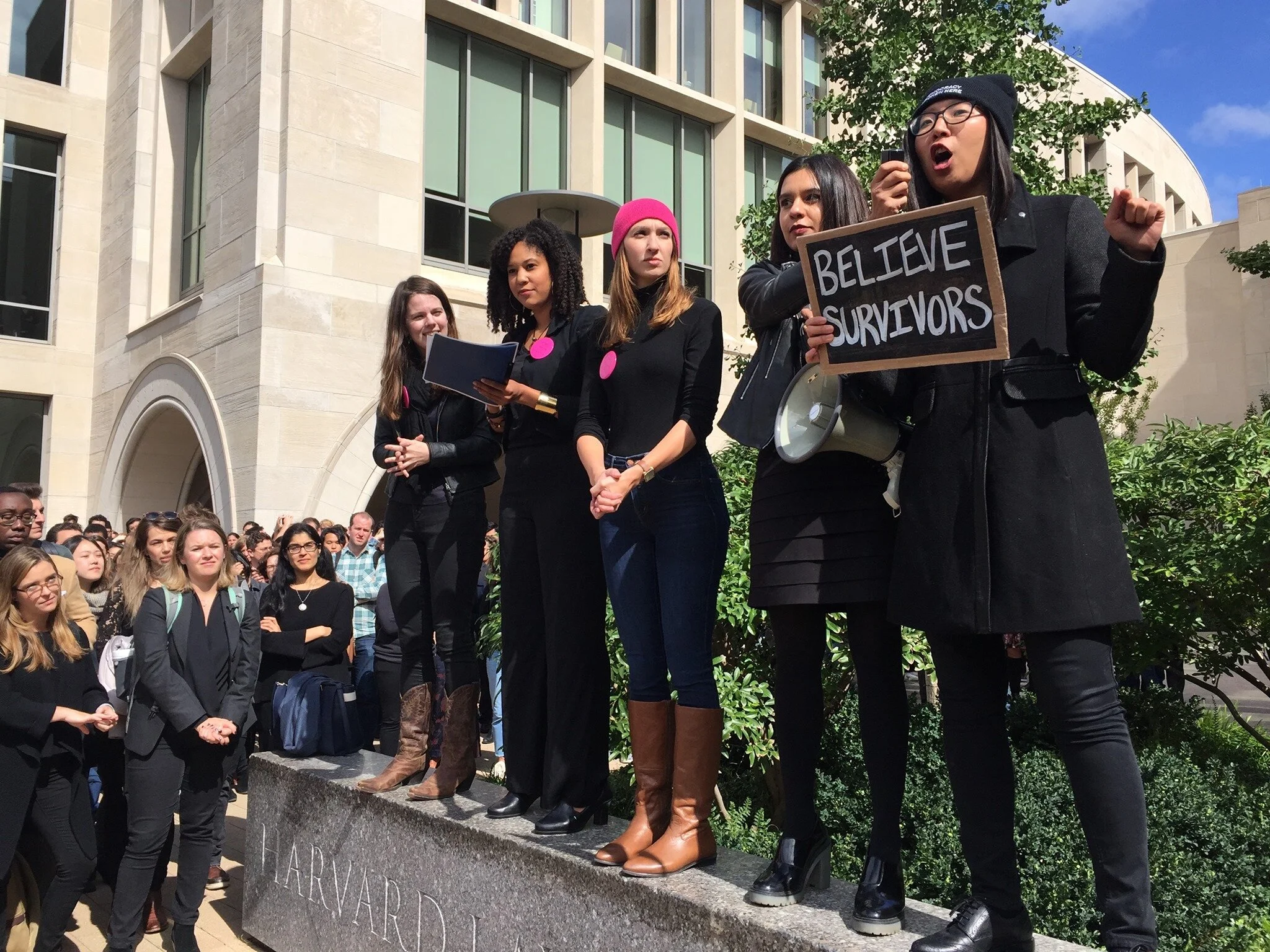
The People’s Parity Project is a nationwide network of law students and new attorneys organizing to unrig the legal system and build a justice system that values people over profits. They began at Harvard Law School, but now have chapters all over the U.S.
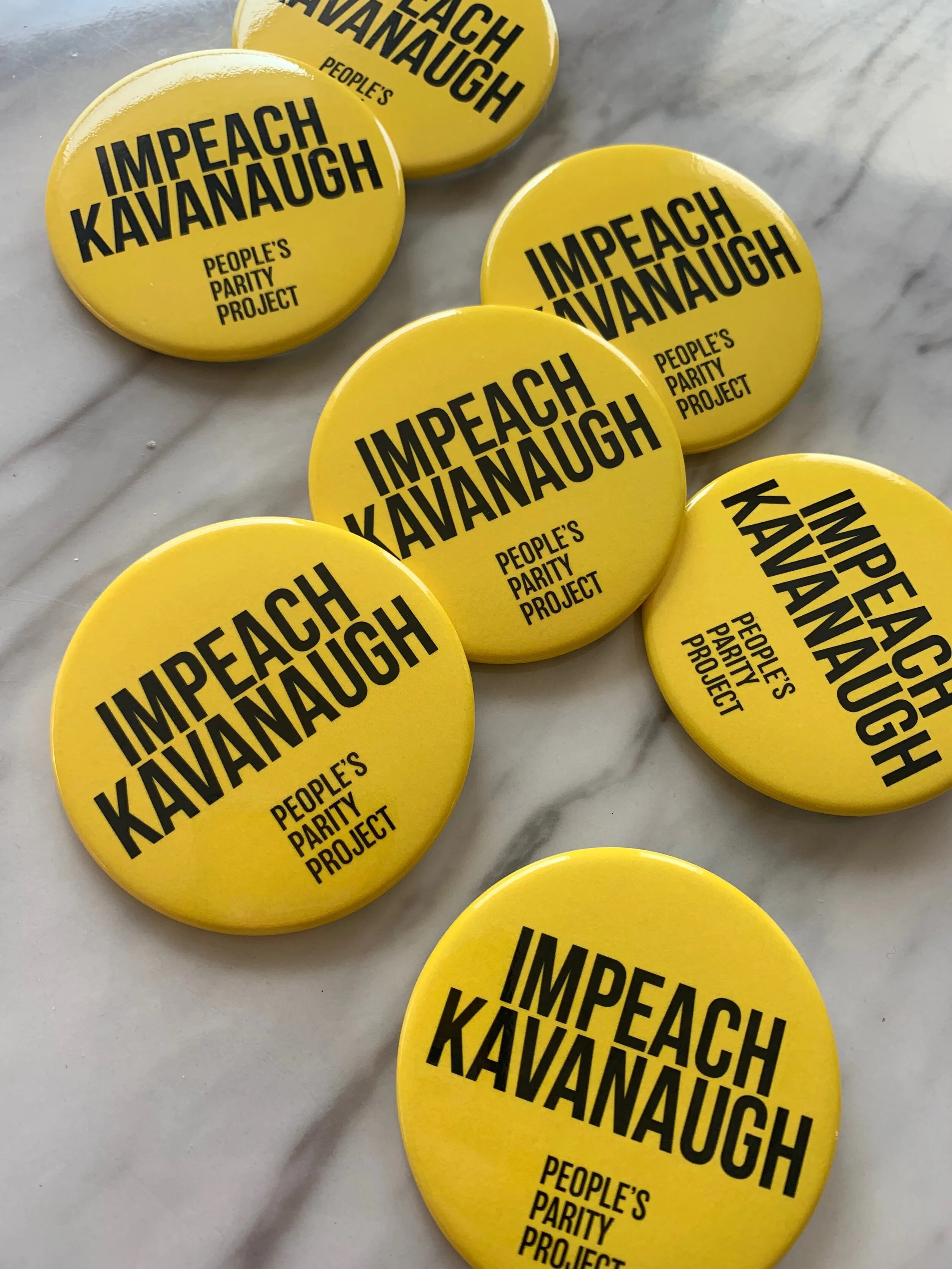
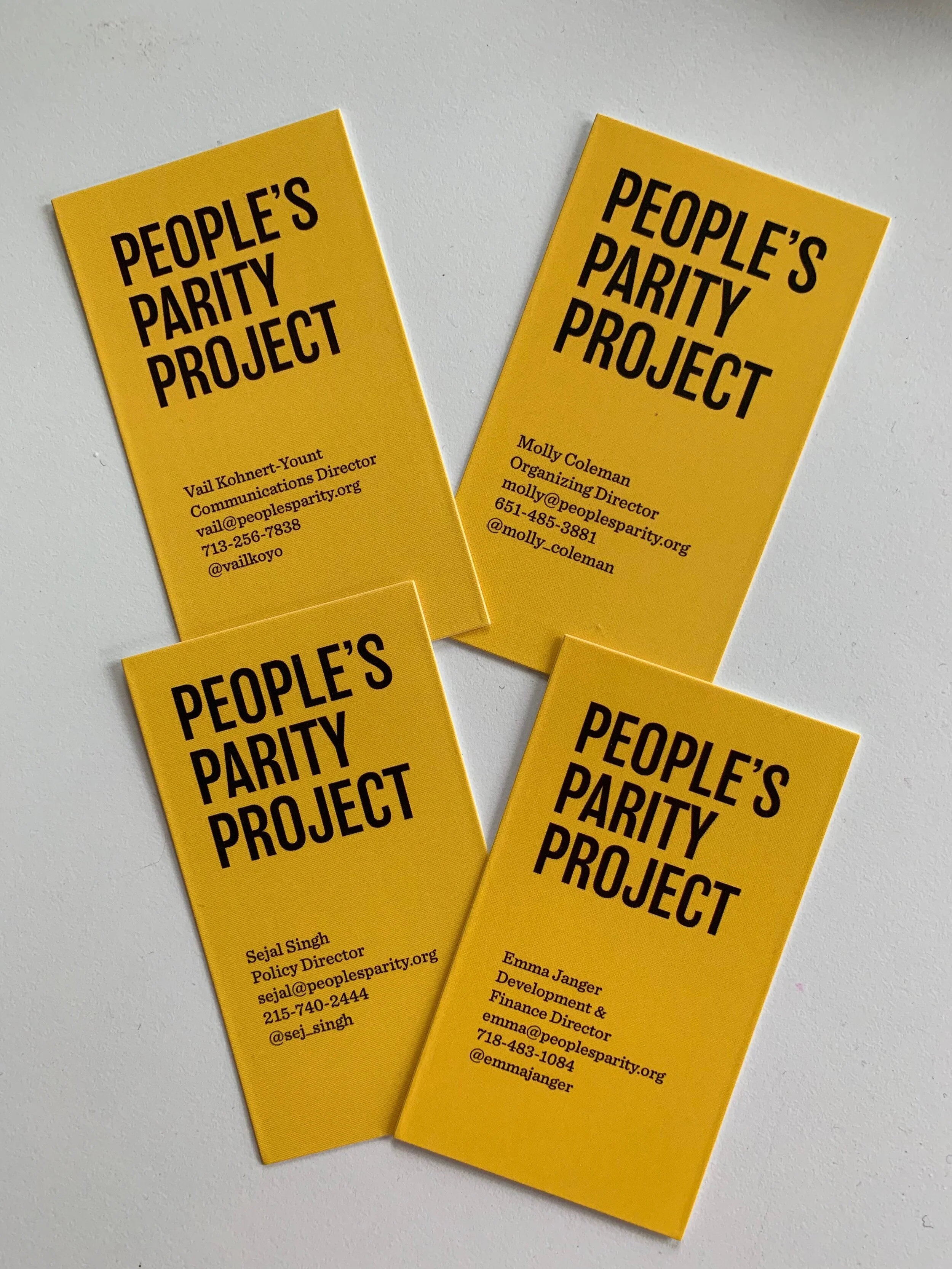
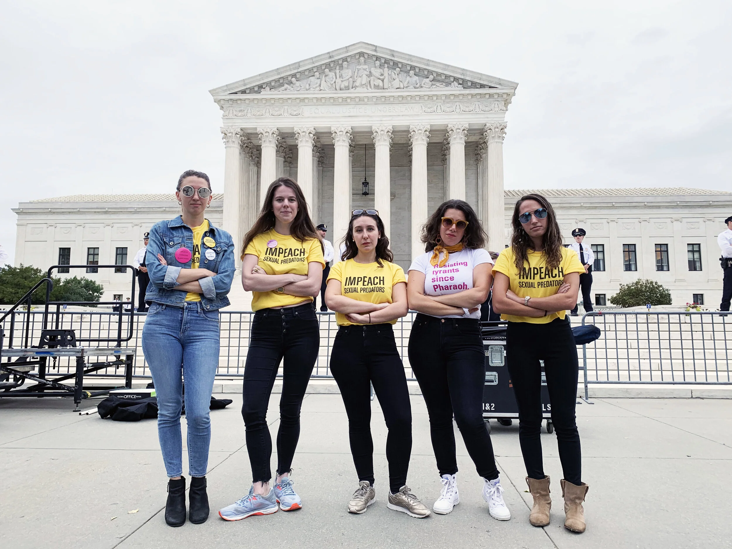
They came first to my mom for a new name, and then to me for an updated look. Together, we were able to match their visual presence with their bold voice and ideas. I updated their identity with a new logo, display typeface, and business cards. They were then able to apply these elements on their own to create badass merch (hello protest tshirts!) and grow their social media presence.
SUMMER 2019
BRANDING, IDENTITY


Old Logo
New Logo


Balboa Typeface by Parkinson type was the chosen display font. It was bold and condensed, but also had some friendly curves. Loud, but still accessible.